Easily create sortable, draggable and collapsible trees — vanilla TypeScript, lightweight and no dependencies.
Getting Started
You can either install this package using NPM and import it into your JavaScript or TypeScript project or directly download it from a CDN.
You can find a detailed description of all available configuration options in the official Readme on GitHub. Alternatively continue reading here and check out some example code below.
Follow this guide to get started ⟶
Preparing Node Data
A sortable tree is generated based on an
recursive array of tree nodes. Every node
contains two properties — a data object
and a nested array of nodes that inherit the
same structure and therefore build a recursive tree.
The data object can contain any number of
custom properties. The names of those properties don't
matter at all. The shape is freely defined by the
application and the developer.
The data object can be accessed by the render function in order to define the content and behavior of each node.
Basic Configuration
First, it is required to included the
sortable-tree.css into your bundle in order to
handle the basic tree functionality — this will not
apply any other styling but folding
and indentation.
Now the actual tree can be created. The most basic
configuration only requires a nodes object
array and a target element.
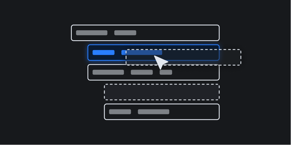
Custom Labels
The actual clickable and draggable area — the label — is rendered by a fully customizable function that can be passed to the tree constructor.
Custom Icons
Custom icons to indicate opened and collapsed nodes can be defined using the icons property. Any string, including HTML or SVG, can be used here as values.
Confirmation Dialog
It is possible to catch the drop event and wait for confirmation before actually moving things around.
Handling Change Events
You can define your own drop event handler in the tree constructor options.
Handling Click Events
Aside from drop events, it is also possible to define a custom handle for click events.
Finding and Revealing Nodes
You can search for nodes and interact with them. Click here in order to reveal the hidden node with the title "Deep Nested Page".
Disabling Sorting
In case you just want to create a tree instance in your app that doesn't provide any sorting functionalty, you can easily disbale the drag-and-drop behavior.
Unlocking Root
By default, users are not allowed to move nodes next to the
root node on the top level. This is useful in order to
address use cases such as an actual file system tree that
can only have on root node. However, it is possible to
disable this restriction by setting the
lockRootLevel option to false.
Unstyled
By default, the sortable-tree.css, that
is required to be imported, only covers the most
basic functionality such as collapsing and indentation. You
can add your own custom CSS
classes to the rendered elements as well as fully customize
the render function. Without
any theming, the generated tree looks as follows. In
addition to that, the basic styles are controlled by
custom properties
that allow for easy integration into other design systems.
Custom Theme
The theme that is used here on this example page can be
found as a .less file on
GitHub
and serves as a good boiler plate for custom themes.